What I learned in this course:
I learned that a clients needs and my own abilities are the difference between a marketable product and a hobby piece.
I also learned that some projects need to be designed with the intent that the end user may not know all of the ins and outs of the software, even if their name tag says they are a "team member".
In the end, I feel that this course taught me more than I thought that it would.
Tuesday, May 8, 2012
Monday, May 7, 2012
Adobe Tutorial #5
Magic lighting affect:
Step 1: create a radial gradient layer.
Select an area with the selection tool.
Layer > New Fill Layer > Gradient...
Make sure to select the "Radial" gradient from the dropdown menu.

Step 2: Add an icon. (an "emitter")
I created mine by using concentric circles and separate layers.


 Step 8: Add a gaussian blur to a filled shape, and a few extra flourishes

Step 1: create a radial gradient layer.
Select an area with the selection tool.
Layer > New Fill Layer > Gradient...
Make sure to select the "Radial" gradient from the dropdown menu.

I created mine by using concentric circles and separate layers.

Step 3: Add some text. Apply the Distort >Wave filter.
My text is lines from a video game.
"This was a triumph! I'm making a note here: Huge Success. It's hard to
overstate my satisfaction. Aperture Science - we do what we must because
we can. For the good of all of us, except the ones who are dead. But
there's no sense crying over every mistake. You just keep on trying till
you run out of cake. And the science gets done. And you make a neat
gun. For the people who are still alive. I'm not even angry. I'm being
most sincere right now. Even though you broke my heart and killed me.
And tore me to pieces. And threw every piece into a fire. As they
burned, it hurt because I was so happy for you. Now these points of data
make a beautiful line. And we're out of beta; we're releasing on time.
So I'm GLaD I got burned. Think of all the things we learned. For the
people who are still alive. Go ahead and leave me. I think I prefer to
stay inside. Maybe you'll find someone else to help you. Maybe Black
Mesa. That was a joke - Ha Ha! Fat Chance! Anyway, this cake is great.
It's so delicious and moist. Look at me still talking when there's
science to do. When I look out there, it makes me GLaD I'm not you. I've
experiments to run. There is research to be done. On the people who are
still alive. And, believe me, I'm still alive! I'm doing science and
I'm still alive! I feel FANTASTIC and I'm still alive! While you're
dying, I'll be still alive! And when you're dead, I will be still alive!
Still Alive! Still Alive..."
I didn't use all of it, just some of it.
Step 4: Rotate the text into place

Step 5: Add some light using glow. Be sure to create different values.
Step 6: Group the lines of text together, and mask the ends to make them disappear at both ends.

Step 7: Create a "spot light" effect by adding a circle of white at the bottom.


This didn't turn out as I intended, but I still think that it came out beautiful.
Source:http://abduzeedo.com
Job Search Analysis III
Advertising Designer
Job Description:
Advertising Designers take a clients ideas and make them into reality via audiovisual presentations, these can be commercials, pitches, and websites. The Advertising Designer uses a variety of media to this, including audio, video, text, graphic arts, and animations.
Education Requirements:
No education required, but most professionals have at least an associates degree in marketing or business.
Preferred skills & Software:
Most of the adobe suite, video editing software, word processors. Really anything art related. People skills are also important as well as an understanding of the need for marketing and advertising in the business setting.
Salary range:
$36,000
Years of Experience:
0
Lawsuit Summary
This blog post will summarize a lawsuit pertaining to copyright infringement, intellectual property, font dispute, brand, logo or image issues.
NBC Universal Vs. P22
In 2011, NBC Universal was sued over the use of the Cezanne Regular type face font. This font was used in relation to the Harry Potter franchise, specifically to create a, "Hedwig Pillow," a "Dementor Cap," and a "Hogwarts Stationery Set."
As stated in the source article, according to Code of Federal Regulations (Chapter 37), fonts can't be copyrighted, but the software that uses them can be. Most font software has a clause that says it can't be used to make commercial works without express permission from the font creators.
In the end, this case depends upon proof that the software was used to create the commercial work.
This case was dismissed in January, 2012. The plaintiffs and the defendants found that the real issue was whether an end-user licensing agreement for the font software was breached.
Sources:
www.hollywoodreporter.com
www.hollywoodreporter.com
Friday, April 27, 2012
Adobe Tutorial #4
Adobe Tutorial #4:
Selective Color Change
This tutorial will explain how to change a selected color on an image to any other color.
This is primarily used for retail ads (clothing, cars, appliances).
Steps:
1. Choose a photo.
My photo is from a lawnmower website. I do not own any rights to this image, I am just using it for school.
2. Open it in Photoshop
3. Select > Color Range
4. Use the eyedropper tool to select the color you want to change. Also, select any similar colors.
With this photo I chose the red color range.
5. Create a new layer
6. Fill the new layer with a new color. I chose a green color.
7. Set the new layers blending mode to "Hue"
8. If you need more than one new colors, repeat steps 3-6, as needed.
Sources: toolsite.net
Selective Color Change
This tutorial will explain how to change a selected color on an image to any other color.
This is primarily used for retail ads (clothing, cars, appliances).
 |
| Original Image |
Steps:
1. Choose a photo.
My photo is from a lawnmower website. I do not own any rights to this image, I am just using it for school.
2. Open it in Photoshop
3. Select > Color Range
4. Use the eyedropper tool to select the color you want to change. Also, select any similar colors.
With this photo I chose the red color range.
5. Create a new layer
6. Fill the new layer with a new color. I chose a green color.
7. Set the new layers blending mode to "Hue"
8. If you need more than one new colors, repeat steps 3-6, as needed.
Sources: toolsite.net
 |
| Green Hue |
 |
| Blue Hue |
Job Search Analysis II
Art Director
Job Description:
Art directors are in charge of the overall "look" of a product.
An art director has to have a fine blend of talent, skill, and knowledge to produce outstanding work.
An art director is the visionary behind any piece of work
Education requirements:None
Job Description:
Art directors are in charge of the overall "look" of a product.
An art director has to have a fine blend of talent, skill, and knowledge to produce outstanding work.
An art director is the visionary behind any piece of work
Education requirements:None
Preferred skills & Software:
Design skills, use of the adobe suite, and some design experience.
Design skills, use of the adobe suite, and some design experience.
Experience in all aspects of multimedia design
Salary range:
$67,000
$67,000
Years of Experience:
0
0
Wednesday, April 18, 2012
Job Search Analysis I
Production Artist
Job Description:
Graphic artists use art and text to convey information.
As a production artist you will get to do a bit of everything on the copy side of printing.
Design skills will be used less in this position.
Education requirements:
None
Preferred skills & Software:
Design skills, use of the adobe suite, and some design experience.
Salary range:
$47,000
Years of Experience:
0
www.seekingsources.com
www.indeed.com
Final Project
The purpose of this project is to showcase my comic book.
I will show the first demo issue.
The Target Audience is mainly males ages 10-30, with a secondary audience of females from 15-25
The call to action will be the title of the issue. (Which will also have the website address.)
The project specifications:
Flat Size: 11 x 16.75"
Folded Size: 8.5 x 11"
Trim Size: 1/8th inch
Bleed:1/8th inch
Finishing:None
# of Colors: Multi ( more than 4). CMYK.
Paper: Brochure Paper
Price to Produce:$328 for 150
Master Image List Elements:
This will have Bitmap images (more elements will be added soon)
Print quote: 48hourprint.com

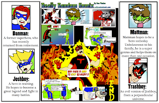
<Front/Back of the GateFold.
Inside of the GateFold>
Copyright for project images:
I will /have already produce(d) all of the images for this project
Copyright@ DanPhelan_2012
This will have Bitmap images (more elements will be added soon)
Print quote: 48hourprint.com


<Front/Back of the GateFold.
Inside of the GateFold>
Copyright for project images:
I will /have already produce(d) all of the images for this project
Copyright@ DanPhelan_2012
Wednesday, April 4, 2012
Adobe Tutorial #3

How to add a Sepia tone to a photo:
--Original Image
- Open the image in Photoshop.
- If the image is in color, go to Image > Adjust > Desaturate and skip to step 4.
- If the image is in grayscale go to Image > Mode > RGB Color.
- Go to Image > Adjust > Variations.
- Move the Fine<-->Coarse slider down one notch less than the middle.
- Click on More Yellow once.
- Click on More Red once.
- Click OK.
 And Voila! You now have a photo with nostalgia.

Copyright @me and my friend Julia, who just graduated from high school...
Source:graphicsoft.about.com
National Logo Redesign
I will be analyzing the rebranding of DC Comics.
The new brand is a complete rebranding of the entire company.
The implementation of the new brand is for the implementation of the "DC Nation" which is a combination of digital, physical print, animation and online content.
They are using a "peel" effect with the "D" peeling away from the "C", this is supposed to represent the duality of the characters in the DC Stable.
As far as the rebranding goes, I could care...
But with the rebranding comes a complete overhaul of DC Stories. Which, I do not like...
Information source: www.deadline.com
Also, any DC comic book in the last 3 months...
Wednesday, March 28, 2012
Everyday Design Inspiration
Examples:
1.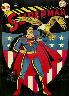 Superman #14 Cover
Color: This cover uses the three primary colors, Yellow, Red, and Blue. (Part of this choice was the availability of colored inks at the time of printing.)
Typography: The "Superman" title was specially made for this series and has remained (relatively) unchanged for close to 80 years.
Logo: The superman logo has gone through many changes over the years, and has adapted to changing times.
Target Audience: This comic was targeted at children, generally boys.
Call to Action: The eagle is the call to action, this issue was extremely patriotic. (It was produced during WWII)
Production Process: The way that this issue was produced was by a lithographic printer and a web feeding system. It was considered a short order because there were only 10000 created.
2.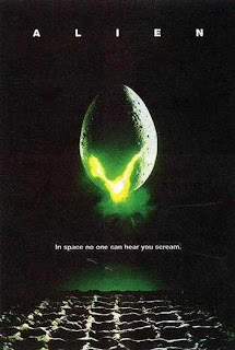 Alien Poster (1979)
Color: The use of Green as the focal point draws the eye.
Typography: Using a thin sans-serif elicits a mechanical or alien feeling.
Logo: There isn't really a logo, but the egg might be considered one...
Target Audience: Males primarily. (ages 18-45)
Call to Action: The glowing stuff coming out of the egg.
Production Process: Multi-Color Lithographic Printing.
3.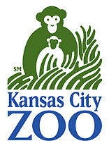 Kansas City Zoo Logo
Color: Green and Blue primarily, with a good use of negative space.
Typography: A Serif Font
Logo: The logo emits a "nature" feel as well as showing a pair of "monkeys", which are one of the zoos major attractions.
Target Audience: Everyone who likes animals.
Call to Action: The monkeys are the focal point, but they lead to the text.
Production Process: This is on a variety of products.
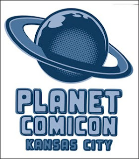 4.Planet Comicon Poster
Color:Blues
Typography: Sans-Serif for another "alien" looking font
Logo: The planet (probably modeled after Saturn)
Target Audience: Males, primarily (again) But, everyone equally.
Call to Action: The Planet, which leads down to the Text.
Production Process: It looks like Vintage comic books, with the dot design.
All of these are things that inspire me, but specifically, in order of appearance, they are;
1. A comic poster that I saw at the Planet Comicon I attended over springbreak.
2. Another poster that I saw over the weekend.
3. The Kansas City Zoo logo, I saw it when I went to the zoo...
4. This is the official Planet Comicon logo.
These are the things that inspire me, if this isn't good enough, Tough.
1.
 Superman #14 Cover
Color: This cover uses the three primary colors, Yellow, Red, and Blue. (Part of this choice was the availability of colored inks at the time of printing.)
Typography: The "Superman" title was specially made for this series and has remained (relatively) unchanged for close to 80 years.
Logo: The superman logo has gone through many changes over the years, and has adapted to changing times.
Target Audience: This comic was targeted at children, generally boys.
Call to Action: The eagle is the call to action, this issue was extremely patriotic. (It was produced during WWII)
Production Process: The way that this issue was produced was by a lithographic printer and a web feeding system. It was considered a short order because there were only 10000 created.
2.
 Alien Poster (1979)
Color: The use of Green as the focal point draws the eye.
Typography: Using a thin sans-serif elicits a mechanical or alien feeling.
Logo: There isn't really a logo, but the egg might be considered one...
Target Audience: Males primarily. (ages 18-45)
Call to Action: The glowing stuff coming out of the egg.
Production Process: Multi-Color Lithographic Printing.
3.
Color: Green and Blue primarily, with a good use of negative space.
Typography: A Serif Font
Logo: The logo emits a "nature" feel as well as showing a pair of "monkeys", which are one of the zoos major attractions.
Target Audience: Everyone who likes animals.
Call to Action: The monkeys are the focal point, but they lead to the text.
Production Process: This is on a variety of products.
 4.Planet Comicon Poster
Color:Blues
Typography: Sans-Serif for another "alien" looking font
Logo: The planet (probably modeled after Saturn)
Target Audience: Males, primarily (again) But, everyone equally.
Call to Action: The Planet, which leads down to the Text.
Production Process: It looks like Vintage comic books, with the dot design.
All of these are things that inspire me, but specifically, in order of appearance, they are;
1. A comic poster that I saw at the Planet Comicon I attended over springbreak.
2. Another poster that I saw over the weekend.
3. The Kansas City Zoo logo, I saw it when I went to the zoo...
4. This is the official Planet Comicon logo.
These are the things that inspire me, if this isn't good enough, Tough.
Wednesday, March 14, 2012
Adobe Tutorial #2
Silhouetting:
This is the act of "cutting" an image from it's original surroundings, usually to place it somewhere else entirely.
Link to tutorial:
www.photoshopessentials.com
Before:
Step 1.
Select the shape within the image to be "silhouetted".
This can be done with a variety of tools, most instructors will recommend the Pen tool, but I prefer the Magnetic Lasso, as it "sticks" to an image. Also the regular lasso, along with the shift key or the alt key, can be used to fine tune the selection.
Step 2.
Cut away the rest
Once you have the image selected, as desired, use the inverse selection to select everything but the image. That way, you have only what you need.
Step 3.
This step can go one of two ways, you can either fill in the selection, or place the selection in a new setting.
A. Fill in the selection:
Select All (Command-A)
Use the paint bucket to fill in the selection.
B. Place the selection in a new setting
Select All (Command-A)
Copy the Selection (Command-C)
Paste the selection into a new setting (Command-V)
Finished images:
A. (This Kind of didn't work, so I went with the other one...)
B.
Anyways, This has been Adobe Tutorial #2: Silhouettes
Copyrights: This is a photo from a hallmark card, I sent them an email asking for permission, and they said, " as long as the photo is not for commercial use" I can use it...
Once again:
Link to tutorial:
www.photoshopessentials.com
This is the act of "cutting" an image from it's original surroundings, usually to place it somewhere else entirely.
Link to tutorial:
www.photoshopessentials.com
Before:

Step 1.
Select the shape within the image to be "silhouetted".
This can be done with a variety of tools, most instructors will recommend the Pen tool, but I prefer the Magnetic Lasso, as it "sticks" to an image. Also the regular lasso, along with the shift key or the alt key, can be used to fine tune the selection.
Step 2.
Cut away the rest
Once you have the image selected, as desired, use the inverse selection to select everything but the image. That way, you have only what you need.
Step 3.
This step can go one of two ways, you can either fill in the selection, or place the selection in a new setting.
A. Fill in the selection:
Select All (Command-A)
Use the paint bucket to fill in the selection.
B. Place the selection in a new setting
Select All (Command-A)
Copy the Selection (Command-C)
Paste the selection into a new setting (Command-V)
Finished images:
A. (This Kind of didn't work, so I went with the other one...)

B.

Anyways, This has been Adobe Tutorial #2: Silhouettes
Copyrights: This is a photo from a hallmark card, I sent them an email asking for permission, and they said, " as long as the photo is not for commercial use" I can use it...
Once again:
Link to tutorial:
www.photoshopessentials.com
Wednesday, March 7, 2012
Magazine And Billboard Advertisement Project
The magazine I chose to advertise in was PIMagazine, it is a monthly publication for private investigators and law enforcement.
I'm not sure what my budget is, but I'm going to guess that it is more than $97.
These are the specifications directly from the website:

The Readership Demographic is mainly men and women in Private Detective work, along with some City, State, and Federal Investigators, as well.
I will have a microsoft tag in this ad...
This is my microsoft tag...
5 thumbnails:

1 rough (ruler used):

When this project was joined with the Bill board project I decided to change the message and "ad" of my project. I shifted from a sales perspective to a eco-friendly not-for-profit.
So, this is my new bill board design. I will probably make this my new magazine as as well, because it is equally relevant everywhere...
The difference between a billboard design and other projects is the distance and time readers have to see it. A billboard is at least 30 feet away and only visible for 4-5 seconds on a slow highway.
With those in mind, the resolution of any billboard project doesn't need to be extremely high, usually around 72 ppi.
The purpose of my billboard is to increase awareness about the need for everyone to recycle.
The target audience is everyone, I know that isn't acceptable, but everyone really should recycle...
Project specifications:
22ft 8in X 10ft 5in
The file should be created at 72 ppi and be 22.662 in X 10.412 in
Cost to produce: $1,150.00 (this is a quote from prolabdigital).
I called them and explained my project and this is the quote they gave me.
5 Thumbnails:

2 Roughs:...
What I started with:

Copyright: All artwork produced is my own.
Information for magazine ad from: PIMagazine.com
Information for billboard ad from: Lamar Graphics and ProlabDigital.
Adobe Tutorial #1
How to make a color photo black and white, with one color accented.
Here is the photo I'm starting with.
It was a stock photo supplied to me by dropbox an online file share service.
 Isn't he cute?
Step 1.
Create a new layer on top of the "background" layer.
 <--This is the button for it...
Step 2.
select the "background" layer.
Step 3.
Use the lasso tool to select something that should be colored.
OR, you can use Select>Color Range... and use the dropper to select a range of a specific color, I chose red.
Step 4.
Use Select>Inverse
This selects everything EXCEPT for what you want to change color.
Step 5.
Select the new layer created in step 1.
Step 6.
Use the paintbrush tool and make everything black.
Step 7.
Set the blending mode for the layer to Hue.
 <---This is what it looks like.
Step 8.
Enjoy.
Finished product:

Link to tutorial: www.instructables.com
Although, I didn't really need the tutorial to do this.
Tuesday, March 6, 2012
Master Image Descriptions
Bitmap:
A Bitmap is a map of bits, or dots. Filetypes associated with Bitmaps are; BMP, JPEG, GIF, PICT, PCX, and TIFF. A Bitmap is resolution depending, so don't get too close.
Reverse:
A Reverse is when a block of color is used and the paper source is used as "white".
This is a good use of negative space.
Vector Art:
Vector Art is Resolution independent. Meaning that, no matter how large or small it gets, the proportions are the same. It is math-based, as well. Filetypes associated with vector art are; .AI, CGM, SVG, .CDR, and .3ds (for 3-D Vectors).
Grayscale Raster:
A Grayscale Raster is a set of cells that are between 0 and 255. 0 is "white" and 255 is "black". This is a very simple image set. Filetypes associated with grayscale raster are; PNG, TIFF, BMP, and GIF.
Duotone Raster:
A Duotone Raster is a halftone image with another halftone image printed on top of it. (usually in black.)
It comes from Cyanotype, it was used in newspapers and comic books.
Silhouette Raster:
A Silhouette Raster is when an image is "cut out" of it's surroundings and used in a new setting. The filetypes associated with silhouette rasters are; TIFF, EPS, PSD, and PDF.
Full Bleed Raster:
A Full Bleed Raster is a raster image that "bleeds" out over the edges of a paper. This is designed to be cut, without losing vital detail. Full Bleeds can be present in most filetypes.
Four Color Raster:
A Four Color Raster is raster that includes 4 colors. Also, they can be present in most filetypes.
Screen Tint:
A Screen Tint is "A screen pattern that consists of dots that are all the same size and create an even tone."
sources: www.printingtips.com
The book for this course.
Personal experience.
Tuesday, February 28, 2012
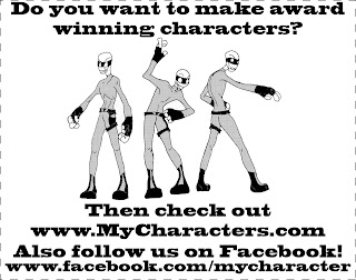
Newspaper ad project
Budget: $97
Formula:
Column width x height = size x $4
My Dimensions:
4(7.71") x 6.0625" = 24.25 x $4 = $97
My target audience is artists of all ages and skill levels.
My call to action will is "Make great characters"
I had to use a bitmap image on this ad. It had to be created by line drawing first and tracing with a .5 inch sharpie pen. (.5 was a personal choice)
Line screen is important with bitmaps as they are measured by lines per inch.
5 thumbnails
1 rough (ruler used)
Formula:
Column width x height = size x $4
My Dimensions:
4(7.71") x 6.0625" = 24.25 x $4 = $97
My target audience is artists of all ages and skill levels.
My call to action will is "Make great characters"
I had to use a bitmap image on this ad. It had to be created by line drawing first and tracing with a .5 inch sharpie pen. (.5 was a personal choice)
Line screen is important with bitmaps as they are measured by lines per inch.
5 thumbnails

1 rough (ruler used)

Tuesday, February 14, 2012
Chapter 8,9,&10
CSR role: Customer Service Representatives are the common contacts for a job and should be informed of everything about your job when dropping it off at the printer.
Talking with the Printer: Usually when you go to the printer, a salesperson will be your first contact, they will ask you questions about your job and refer you to a CSR, who can handle your job.
Planning for Print: When planning for your print, always keep the dimensions, colors, and substrates of your job in mind. These can include;
Document Size, Adequate Bleed, and Internal Panel sizes.
Check Rasters/Vectors: When supplying rasters for a project, be sure that it is in the proper format for the printer, and be sure that the resolution is set correctly. Depending on your job, the resolution can be drastically different. With Vectors be sure that they have the correct colors (Pantones are a safe bet here). Also be sure to supply the proper images and fonts. This can be done by either embedding them or package the images and fonts together. The best practice is to embed the images and fonts, but also package them , as well, just to be safe.
Types of proofs: sometimes called random proofs or scatter proofs, these show a sample of what your project should look like after being printed.
Scale & Rotate in PS: Always scale and rotate any images in photoshop or some other file editing software before placing it in InDesign.
Resolution for output: Usually, 300 Dpi is the proper resolution for output. Although depending on the project a a lower resolution could be "good enough", especially if the project is a large banner or sign.
Color Space in PS & AI: Always convert images to Pantone or spot colors. This way the printer can match the color exactly, and it will look correct, no matter what.
Flatten or layered: The choice of using a flattened image or a layered image depends on two things, the user and the printer. If the user is skilled, then they may be able to use layered files efficiently, and if the printer allows for it, layered files may fly, but if either of them don't work well with layers, then flattening is the way to go. Just be sure to save an extra copy before destroying some part of a project.
Transparency: Transparency is the amount of alpha in pixels. Something between 1 and 0. The less alpha a pixel has the less visible it is.
Creating a Path: Paths are created by drawing a shape on top of an image and choose create clipping mask. This path will show through like a window in whatever shape the path was in.
Duotones: Duotones are images that are comprised of 2 colors, usually black and a spot color, although, sometimes black can be traded for another spot color, depending on the designers specifications.
AI Artboards: This is the imaginary "paper" that a designer can use to create vectors in Adobe Illustrator.
Bleed Settings: Bleed Settings in Ilustrator apply to all sides, they can not be custom shapes. They can be up to one inch in depth.
AI Simplify complex art: The simplify command in ilustrator "modifies" an image by reducing the number of points used to make a vector image.
AI Clean Up: Clean up deletes all points outside of the current work.
AI Effects & Clipping Mask: Effects in illustrator either alter the inside, the outside, or both, of a vector path. Clipping Masks however, "punch out" parts of an image in the shape of the mask.
AI Transparency: While Transparency may look similar in Photoshop and Illustrator, they have key differences. One of the main differences is that Illustrator will overlap 2 spot colors, which are then converted to CMYK to accommodate the transparency.
AI Linked & Embedded image: You can either link or embed images within illustrator files. If the images are not packaged properly, they can be re-linked. This is of course assuming that the designer still has access to the original image.
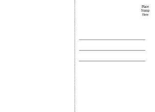
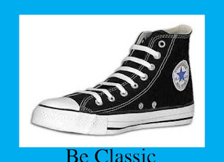
Variable Data Direct Mail Project
The purpose of this project is to create a variable data mailer for a shoe store.
My target audiences are Men and Women.
The Call to Action is a tag line, such as "Be Bold".
Specifications:
Trim Size: 5"tall x 7"wide
Bleed: 1.25"
Margins: .25" all around
Finishing: This will have a gloss finish on one side.
#of Colors: 2 Colors per Post Card
Paper: Card Stock
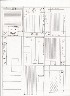
5 Thumbnails:
2 Roughs:
My target audiences are Men and Women.
The Call to Action is a tag line, such as "Be Bold".
Specifications:
Trim Size: 5"tall x 7"wide
Bleed: 1.25"
Margins: .25" all around
Finishing: This will have a gloss finish on one side.
#of Colors: 2 Colors per Post Card
Paper: Card Stock
5 Thumbnails:

2 Roughs:


Thursday, February 9, 2012
Chapters 6 & 7
PostScript: consists of two files: bitmaps and a printer component containing the postscript instructions for printing the character. Can contain only 256 glyphs.
TrueType: consists of a single file. Was unuseable by RIPs until recently. ( Without a little fenagling)
OpenType: consists of a single file. These can be used on Macs and PCs, interchangeably. Also, they can contain more than 65,000 glyphs.
Font Family: typically a set of fonts all with the same typeface, but different sizes, weights and slants.
Glyphs:Single characters in a given font.
Dfonts: data only fonts. These consist of a data fork and a resource fork. Usually named like PostScript fonts, which can be confusing. They require dedicated font management software.
Multiple Master Fonts: these fonts have many changeable variables such as, weights, angles and widths. Although, users rarely knew how to manage the fonts, package the fonts, or ensure that the press operators knew how to handle the fonts.
Licensing: All fonts contain licenses that specify the way the font should be used or distributed. To this end, most fonts must be purchased, to allow the user access to them. EULAs can sometimes be a hassle to deal with, considering that they may prohibit packaging fonts.
File Naming:File naming has come a long way in its life. Originally, file names had to be 8 characters long then a dot and then a 3 letter extension. Now, file names can have spaces, and dashes and almost any character imaginable, so long as it isn't illegal characters. (!@#$*%) Also, not forbidden, but definitely to be avoided, are slashes and colons, as they are usually reserved for file-handling nomenclature within a given software.
Extensions: File extensions have grown just as much as naming conventions. Originally file extensions were all but absent on Macintosh, instead opting for a data and resource fork to control the files. They are really useful for human recognition of file type and cross-platform work.
Formats that can cross platforms: Most formats can cross platforms currently, a few are; .eps, .BMP, .PCT, .GIF, and .JPG, respectively.
Info sources: Real world print production with adobe creative suite applications.
Wednesday, February 1, 2012
The Rundown: Copyright
What is a Copyright?
A Copyright grants an owner the right to reproduce or transfer a drawing, font , photograph, or other images to other media. It also protects music, film, written works, intellectual property (e.g. Mickey Mouse), Online content and images.
A Copyright does not however protect ideas, styles or techniques. This is why a "family style" recipe is kept in a family, because it is extremely difficult to prove that it was stolen.
How is a Copyright awarded?
A Copyright is awarded immediately, as soon as a work is published. (This does not need to be a public publishing, as long as an owner can prove that is was published.) There is nothing else needed to receive a Copyright.
Once an owner has a Copyright, they can assign certain rights to others. Such as copying a specific work for an ad. Usually this confines the use to specific media, and for specific projects.
Copyright notice example: ©DanPhelan 2012
A Copyright notice displays to others that an owner actually owns a work.
Sources personal experience and http://www.copyright.gov
Tuesday, January 31, 2012
Chapters 4&5
File Formats to print: TIFF, PhotoShop EPS, & Photoshop native (PSD).
File formats not to print: PNG, BMP, GIF, and JPEG
Pixels: Small squares that make up the actual image.
JPEG: A lossy file format, JPEGs compress images for efficient file size. This compression causes losses in image quality.
RAW: A less compressed image file format, although this file format can not be put directly on a computer. It can, however, be imported into photoshop as a PSD.
ppi Resolution: Pixels Per Inch resolution refers to the amount of pixels required to produce one square inch of an image.
Bitmap Images: BMP or Bitmap images are can go from 1-32 bit. Which is Black and White, to shades of gray. It does not support CMYK.
Cropping/Rotating: Cropping is the act of clipping the image to a useable size, there is debate over whether this should be done early in the design phase or later.
Rotation: Rotation is the act of turning the image by degrees. The dangers with this is if the image is turned to anything other than 0,90,180,270 or even 360, then there can be digitization, which will reduce the image quality.
Transparency Tip: Sometimes when importing an Illustrator file (.ai) into Indesign, transparencies lose image quality. It must first be converted to EPS, to work properly.
Vector graphics: Vector graphics are resolution independent graphics, meaning that no matter how large or small they are scaled, they will look, generally the same. This is all due to the magic of math.
Vector file formats: Vector file formats are generally .ai (Adobe Illustrator) and .eps (Encapsulated PostScript). Both formats have unique qualities and abilities. However, .ai is the more widely used format.
Embedding fonts: Embedding fonts is the act of packaging the necessary fonts with a project, to allow it to print properly. This does not mean that a user can edit the text. To do that, the user must have the fonts active on their computer.
Outlining text: In Adobe Illustrator, Outlining Fonts is a good way to convert a font to an image. This allows the user to rasterize the text at 100% and export it as a TIFF or other Lossless file format.
Simplify path: This one also comes from Adobe Illustrator, Simplify Path removes unneeded or unused pixels and paths in the document.
All of this information comes from my own experience or the text book for this course:
Real World Print Production with Adobe Creative Suite Applications
By Claudia McCue
Thursday, January 26, 2012
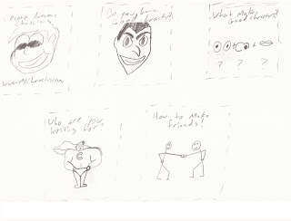
Self-Promotional NotePad
Self- promotional Note Pad:

With this notepad, I was trying to embody technology, creativity, and humor.

With this notepad, I was trying to embody technology, creativity, and humor.
Ten (10) Thumbnails
 These are some of the other Ideas that I had.
You may notice that the one in the top left is the one that I built my rough from.
 These are some of the other Ideas that I had.
You may notice that the one in the top left is the one that I built my rough from.
And 1 Rough

 This is my final image for the notepad. I think it came out quite nicely.
copyright for all images is ©DanPhelan2012.

Purpose: a notepad, and possibly a funny/useful one at that.
Target audience: Anyone who identifies themselves as a "geek"
Mainly, I'm targeting males between the ages of 14-35, who are interested in geek culture, or have IT jobs.
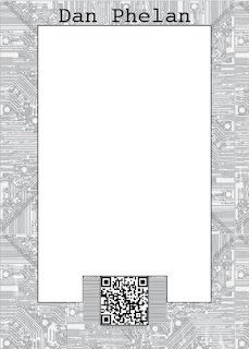
call to action: The QR Code and my info in the bottom left of the page.
Specifications:
7 x 5 inch
Black ink only | no bleed
50 sheets per pad
padded
chip board back & Magnet
Price per pad: $8.00
How long will it take to create the pads: 7+days (about a day to process and print, and then 7 days to ship.)
What type of file do they need to print the pad: .pdf, .ai, .psd, .bmp, .cdr, .clk, .gif, .jpg, .jpeg, .ppt, .pub, .doc, .pcx, .pic, .pict, .pct, .png, .ps, .tif, .tiff, .emf, .wmf,
 This is my final image for the notepad. I think it came out quite nicely.
copyright for all images is ©DanPhelan2012.
Monday, January 23, 2012
Chapters 1, 2, &3
Finishing Processes: Finishing Processes are any actions taken to "finish" a job, these can include folding, embossing, die-cutting, trimming, and binding, as well as a few lesser known finishing processes.
Folding Dummy: A folding dummy is a mock-up of a proposed job. They are annotated and positioned to allow the designer an idea of how the printed pages will be aligned and joined together. Folding dummies prevent many common errors associated with printing; upside down images, continuity issues, incorrect ad or article placement, just to name a few.
Imagesetter: An Imagesetter is similar to a scanner, except instead of scanning an image and printing to paper, it scans an image and creates film, plates, or photo-sensitive paper. An image setter uses a dedicated RIP (raster image processor) to scan images, this is usually done at 1300 - 2500 DPI (dots per inch).
Pica vs Point: Picas and points are increments of measure used in printing and layout. Specifically Typographical layout.
Pica: A pica is 1/6th of an inch.
Point: There are 12 points in a pica, so a point is 1/72nd of an inch.
Die Cutting process: The die cutting process is the act of cutting, scoring or pressing a substrate with a design or blade to create a fold, perforated edges, or embossing.
Importance of Registration: The importance of Registration can mean the difference between having a well made product or spending time, energy, and money to produce it again. Registration is the act of lining all layers of a job to coincide, often this is done with special registration paper with pre-made holes and markings that line up to dowels and clips on the image setter.
Purpose of a RIP : The purpose of a RIP is to scan an image and create a rasterized bitmap from it, also RIPs can create bitmaps from Vector-based Images.
Define VDP: VDP (also known as Variable Data Printing) is a printing process that allows the producer to specialize the product for the end-user. An example of this is a direct mailer that may include an offer for horse back rides or massage therapy, the VDP aspect would use a database and produce ads for Horse back rides to certain people, and massage therapy to certain other people, depending on the database requirements. It is also used to direct market, by name, to recipients.
Two color print job : A two color print job is a job that uses black ink and any other color ink to produce visually stimulating artwork.
DPI, LPI, PPI: Units of measurement, and can vary from industry to industry.,
DPI: Dots-per-inch: DPI is generally used for output devices, such as printers, who use dots of color to print a job.
LPI:Lines-per-inch: LPI is used for offset printing, it relies of a grid pattern of different sized dots, each attracting ink to create halftones that simulate shades of colors.
PPI: Pixels-per-inch: PPI refers to the true resolution of an image as viewed on a monitor. This is the basis for all raster based images, the more original pixels in an image, the better the quality.
CMYK vs Spot Colors:
CMYK: Cyan, Magenta, Yellow, and Black. These are the basic colors of process printing, mixing them together in varying degrees produces all (or most) of the colors of the visual spectrum.
Spot Colors: Spot colors are specially mixed inks that produce the same color from any machine that uses them. There are many brands of spot colors, but Pantone is the most widely used.
sources include:
All Pittsburg State University classes before now,
desktoppub.about.com/od/glossaryprint/Prepress_and_Printing_Glossary.htm,
& http://www.webopedia.com/TERM/S/spot_color.html
Wednesday, January 18, 2012
The Rundown: QR Codes

QR Codes, short for Quick Read Codes, are digital representations (much like Bar Codes) of text, geo-locations, and URLs.
The difference between QR and Bar Codes, is that QR Codes can hold a LOT more information.
<---This is what they look like.
<---By the way, if you scan this one, you will go to my blog. But you are already here, so you don't need to. :)
Why are they important?
Most magazines, advertisers and even business cards feature QR Codes. These are the quickest way, currently, to show a lot of information in a short amount of time, and to show that the user is "with it" (as in active in the digital age).
How do I make one?
QR Codes are extremely easy to make, and there are many free websites that will convert your text, URL, images, or geo-location information. I used qrcode.kaywa.com. You should feel free to look around for a generator that you feel comfortable with.
Preflight Significance
The purpose of the Preflight Process is to assure that a design document has no errors. If the design document (often a pdf) has errors, then that can cost the designer and the printer time and money to correct.
An example of a Preflight Check List:
1. Include all fonts with any documents
Always supply font files to avoid unexpected font substitutions. Adobe InDesign is a great tool to use when packaging fonts.
Once again, Adobe InDesign will bundle files together for you with their Package function.
When using this, be sure to save the images as either CMYK, RGB, or Pantone. And specify to the receiver what type the images are, and why.
3. Save images in the proper file format, and at the proper resolution
Generally, when printing, images should be saved as TIFF or EPS files. If you are archiving your images or publishing them to a website or online portfolio, JPEG is alright.JPEG and GIF should never be used for printing.
PrePress PreFlight Technician:
Job Summary
Retrieves digital images and executes preflight processes for digital artwork files.
Salary: $11.00 to 14.00 / hour
Job offer from MailSouth.com
Subscribe to:
Posts (Atom)