Wednesday, April 18, 2012

Job Search Analysis I

Production Artist

Job Description:
Graphic artists use art and text to convey information.
As a production artist you will get to do a bit of everything on the copy side of printing.
Design skills will be used less in this position.

Education requirements:
None

Preferred skills & Software:
Design skills, use of the adobe suite, and some design experience.

Salary range:
$47,000

Years of Experience:
0

sources:
www.seekingsources.com
www.indeed.com

Final Project

The purpose of this project is to showcase my comic book.
I will show the first demo issue.

The Target Audience is mainly males ages 10-30, with a secondary audience of females from 15-25
The call to action will be the title of the issue. (Which will also have the website address.)
The project specifications:
Flat Size: 11 x 16.75"
Folded Size: 8.5 x 11"
Trim Size: 1/8th inch
Bleed:1/8th inch
Finishing:None
# of Colors: Multi ( more than 4). CMYK.
Paper: Brochure Paper
Price to Produce:$328 for 150
Master Image List Elements:
This will have Bitmap images (more elements will be added soon)

Print quote: 48hourprint.com


 <Front/Back of the GateFold.


                                         Inside of the GateFold>


Copyright for project images:
I will /have already produce(d) all of the images for this project
Copyright@ DanPhelan_2012

Wednesday, April 4, 2012

Adobe Tutorial #3


How to add a Sepia tone to a photo:


--Original Image


  1. Open the image in Photoshop.
  2. If the image is in color, go to Image > Adjust > Desaturate and skip to step 4.
  3. If the image is in grayscale go to Image > Mode > RGB Color.
  4. Go to Image > Adjust > Variations.
  5. Move the Fine<-->Coarse slider down one notch less than the middle.
  6. Click on More Yellow once.
  7. Click on More Red once.
  8. Click OK.

    And Voila! You now have a photo with nostalgia.


Copyright @me and my friend Julia, who just graduated from high school...
Source:graphicsoft.about.com

National Logo Redesign

I will be analyzing the rebranding of DC Comics.
The new brand is a complete rebranding of the entire company.
The implementation of the new brand is for the implementation of the "DC Nation" which is a combination of digital, physical print, animation and online content.
They are using a "peel" effect with the "D" peeling away from the "C", this is supposed to represent the duality of the characters in the DC Stable.
As far as the rebranding goes, I could care...
But with the rebranding comes a complete overhaul of DC Stories. Which, I do not like...

Information source: www.deadline.com
Also, any DC comic book in the last 3 months...

Wednesday, March 28, 2012

Everyday Design Inspiration

Examples:
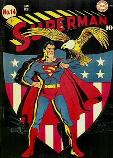
1. Superman #14 Cover
Color: This cover uses the three primary colors, Yellow, Red, and Blue. (Part of this choice was the availability of colored inks at the time of printing.)
Typography: The "Superman" title was specially made for this series and has remained (relatively) unchanged for close to 80 years.
Logo: The superman logo has gone through many changes over the years, and has adapted to changing times.
Target Audience: This comic was targeted at children, generally boys.
Call to Action: The eagle is the call to action, this issue was extremely patriotic. (It was produced during WWII)
Production Process: The way that this issue was produced was by a lithographic printer and a web feeding system. It was considered a short order because there were only 10000 created.

2. Alien Poster (1979)
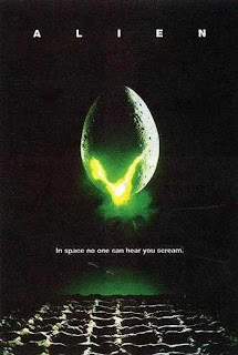
Color: The use of Green as the focal point draws the eye.
Typography: Using a thin sans-serif elicits a mechanical or alien feeling.
Logo: There isn't really a logo, but the egg might be considered one...
Target Audience: Males primarily. (ages 18-45)
Call to Action: The glowing stuff coming out of the egg.
Production Process: Multi-Color Lithographic Printing.


3.Kansas City Zoo Logo

Color: Green and Blue primarily, with a good use of negative space.
Typography: A Serif Font
Logo: The logo emits a "nature" feel as well as showing a pair of "monkeys", which are one of the zoos major attractions.
Target Audience: Everyone who likes animals.
Call to Action: The monkeys are the focal point, but they lead to the text.
Production Process: This is on a variety of products.
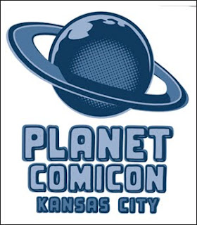


4.Planet Comicon Poster
Color:Blues
Typography: Sans-Serif for another "alien" looking font
Logo: The planet (probably modeled after Saturn)
Target Audience: Males, primarily (again) But, everyone equally.
Call to Action: The Planet, which leads down to the Text.
Production Process: It looks like Vintage comic books, with the dot design.

All of these are things that inspire me, but specifically, in order of appearance, they are;
1. A comic poster that I saw at the Planet Comicon I attended over springbreak.
2. Another poster that I saw over the weekend.
3. The Kansas City Zoo logo, I saw it when I went to the zoo...
4. This is the official Planet Comicon logo.

These are the things that inspire me, if this isn't good enough, Tough.

Wednesday, March 14, 2012

Adobe Tutorial #2

Silhouetting:
This is the act of "cutting" an image from it's original surroundings, usually to place it somewhere else entirely.

Link to tutorial:
www.photoshopessentials.com

Before:


Step 1.
Select the shape within the image to be "silhouetted".

This can be done with a variety of tools, most instructors will recommend the Pen tool, but I prefer the Magnetic Lasso, as it "sticks" to an image. Also the regular lasso, along with the shift key or the alt key, can be used to fine tune the selection.

Step 2.
Cut away the rest

Once you have the image selected, as desired, use the inverse selection to select everything but the image. That way, you have only what you need.

Step 3.
This step can go one of two ways, you can either fill in the selection, or place the selection in a new setting.

A. Fill in the selection:
Select All (Command-A)
Use the paint bucket to fill in the selection.

B. Place the selection in a new setting
Select All (Command-A)
Copy the Selection (Command-C)
Paste the selection into a new setting (Command-V)

Finished images:
A. (This Kind of didn't work, so I went with the other one...)


B.


Anyways, This has been Adobe Tutorial #2: Silhouettes

Copyrights: This is a photo from a hallmark card, I sent them an email asking for permission, and they said, " as long as the photo is not for commercial use" I can use it...
Once again:
Link to tutorial:
www.photoshopessentials.com

Wednesday, March 7, 2012

Magazine And Billboard Advertisement Project

The magazine I chose to advertise in was PIMagazine, it is a monthly publication for private investigators and law enforcement.

I'm not sure what my budget is, but I'm going to guess that it is more than $97.

These are the specifications directly from the website:


The Readership Demographic is mainly men and women in Private Detective work, along with some City, State, and Federal Investigators, as well.

I will have a microsoft tag in this ad...
This is my microsoft tag...


5 thumbnails:


1 rough (ruler used):


When this project was joined with the Bill board project I decided to change the message and "ad" of my project. I shifted from a sales perspective to a eco-friendly not-for-profit.

So, this is my new bill board design. I will probably make this my new magazine as as well, because it is equally relevant everywhere...

The difference between a billboard design and other projects is the distance and time readers have to see it. A billboard is at least 30 feet away and only visible for 4-5 seconds on a slow highway.

With those in mind, the resolution of any billboard project doesn't need to be extremely high, usually around 72 ppi.

The purpose of my billboard is to increase awareness about the need for everyone to recycle.

The target audience is everyone, I know that isn't acceptable, but everyone really should recycle...

Project specifications:

22ft 8in X 10ft 5in

The file should be created at 72 ppi and be 22.662 in X 10.412 in

Cost to produce: $1,150.00 (this is a quote from prolabdigital).
I called them and explained my project and this is the quote they gave me.

5 Thumbnails:


2 Roughs:...

What I started with:


Copyright: All artwork produced is my own.
Information for magazine ad from: PIMagazine.com
Information for billboard ad from: Lamar Graphics and ProlabDigital.