Wednesday, March 28, 2012
Everyday Design Inspiration
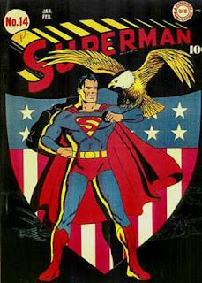
1. Superman #14 Cover
Color: This cover uses the three primary colors, Yellow, Red, and Blue. (Part of this choice was the availability of colored inks at the time of printing.)
Typography: The "Superman" title was specially made for this series and has remained (relatively) unchanged for close to 80 years.
Logo: The superman logo has gone through many changes over the years, and has adapted to changing times.
Target Audience: This comic was targeted at children, generally boys.
Call to Action: The eagle is the call to action, this issue was extremely patriotic. (It was produced during WWII)
Production Process: The way that this issue was produced was by a lithographic printer and a web feeding system. It was considered a short order because there were only 10000 created.
2. Alien Poster (1979)
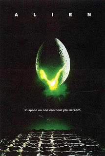
Color: The use of Green as the focal point draws the eye.
Typography: Using a thin sans-serif elicits a mechanical or alien feeling.
Logo: There isn't really a logo, but the egg might be considered one...
Target Audience: Males primarily. (ages 18-45)
Call to Action: The glowing stuff coming out of the egg.
Production Process: Multi-Color Lithographic Printing.
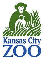
3.Kansas City Zoo Logo
Color: Green and Blue primarily, with a good use of negative space.
Typography: A Serif Font
Logo: The logo emits a "nature" feel as well as showing a pair of "monkeys", which are one of the zoos major attractions.
Target Audience: Everyone who likes animals.
Call to Action: The monkeys are the focal point, but they lead to the text.
Production Process: This is on a variety of products.
4.Planet Comicon Poster
Color:Blues
Typography: Sans-Serif for another "alien" looking font
Logo: The planet (probably modeled after Saturn)
Target Audience: Males, primarily (again) But, everyone equally.
Call to Action: The Planet, which leads down to the Text.
Production Process: It looks like Vintage comic books, with the dot design.
All of these are things that inspire me, but specifically, in order of appearance, they are;
1. A comic poster that I saw at the Planet Comicon I attended over springbreak.
2. Another poster that I saw over the weekend.
3. The Kansas City Zoo logo, I saw it when I went to the zoo...
4. This is the official Planet Comicon logo.
These are the things that inspire me, if this isn't good enough, Tough.
Wednesday, March 14, 2012
Adobe Tutorial #2
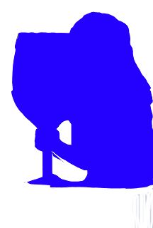
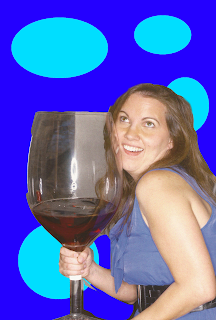
This is the act of "cutting" an image from it's original surroundings, usually to place it somewhere else entirely.
Link to tutorial:
www.photoshopessentials.com
Before:
Step 1.
Select the shape within the image to be "silhouetted".
This can be done with a variety of tools, most instructors will recommend the Pen tool, but I prefer the Magnetic Lasso, as it "sticks" to an image. Also the regular lasso, along with the shift key or the alt key, can be used to fine tune the selection.
Step 2.
Cut away the rest
Once you have the image selected, as desired, use the inverse selection to select everything but the image. That way, you have only what you need.
Step 3.
This step can go one of two ways, you can either fill in the selection, or place the selection in a new setting.
A. Fill in the selection:
Select All (Command-A)
Use the paint bucket to fill in the selection.
B. Place the selection in a new setting
Select All (Command-A)
Copy the Selection (Command-C)
Paste the selection into a new setting (Command-V)
Finished images:
A. (This Kind of didn't work, so I went with the other one...)
B.
Anyways, This has been Adobe Tutorial #2: Silhouettes
Copyrights: This is a photo from a hallmark card, I sent them an email asking for permission, and they said, " as long as the photo is not for commercial use" I can use it...
Once again:
Link to tutorial:
www.photoshopessentials.com
Wednesday, March 7, 2012
Magazine And Billboard Advertisement Project
I'm not sure what my budget is, but I'm going to guess that it is more than $97.
These are the specifications directly from the website:
The Readership Demographic is mainly men and women in Private Detective work, along with some City, State, and Federal Investigators, as well.
I will have a microsoft tag in this ad...
This is my microsoft tag...
5 thumbnails:
1 rough (ruler used):
When this project was joined with the Bill board project I decided to change the message and "ad" of my project. I shifted from a sales perspective to a eco-friendly not-for-profit.
So, this is my new bill board design. I will probably make this my new magazine as as well, because it is equally relevant everywhere...
The difference between a billboard design and other projects is the distance and time readers have to see it. A billboard is at least 30 feet away and only visible for 4-5 seconds on a slow highway.
With those in mind, the resolution of any billboard project doesn't need to be extremely high, usually around 72 ppi.
The purpose of my billboard is to increase awareness about the need for everyone to recycle.
The target audience is everyone, I know that isn't acceptable, but everyone really should recycle...
Project specifications:
22ft 8in X 10ft 5in
The file should be created at 72 ppi and be 22.662 in X 10.412 in
Cost to produce: $1,150.00 (this is a quote from prolabdigital).
I called them and explained my project and this is the quote they gave me.
5 Thumbnails:
2 Roughs:...
What I started with:
Copyright: All artwork produced is my own.
Information for magazine ad from: PIMagazine.com
Information for billboard ad from: Lamar Graphics and ProlabDigital.
Adobe Tutorial #1
Here is the photo I'm starting with.
It was a stock photo supplied to me by dropbox an online file share service.
Isn't he cute?
Step 1.
Create a new layer on top of the "background" layer.
<--This is the button for it...
Step 2.
select the "background" layer.
Step 3.
Use the lasso tool to select something that should be colored.
OR, you can use Select>Color Range... and use the dropper to select a range of a specific color, I chose red.
Step 4.
Use Select>Inverse
This selects everything EXCEPT for what you want to change color.
Step 5.
Select the new layer created in step 1.
Step 6.
Use the paintbrush tool and make everything black.
Step 7.
Set the blending mode for the layer to Hue.
<---This is what it looks like.
Step 8.
Enjoy.
Finished product:
Link to tutorial: www.instructables.com
Although, I didn't really need the tutorial to do this.
Tuesday, March 6, 2012
Master Image Descriptions
Bitmap:
A Bitmap is a map of bits, or dots. Filetypes associated with Bitmaps are; BMP, JPEG, GIF, PICT, PCX, and TIFF. A Bitmap is resolution depending, so don't get too close.
Reverse:
A Reverse is when a block of color is used and the paper source is used as "white".
This is a good use of negative space.
Vector Art:
Vector Art is Resolution independent. Meaning that, no matter how large or small it gets, the proportions are the same. It is math-based, as well. Filetypes associated with vector art are; .AI, CGM, SVG, .CDR, and .3ds (for 3-D Vectors).
Grayscale Raster:
A Grayscale Raster is a set of cells that are between 0 and 255. 0 is "white" and 255 is "black". This is a very simple image set. Filetypes associated with grayscale raster are; PNG, TIFF, BMP, and GIF.
Duotone Raster:
A Duotone Raster is a halftone image with another halftone image printed on top of it. (usually in black.)
It comes from Cyanotype, it was used in newspapers and comic books.
Silhouette Raster:
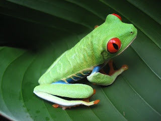
A Silhouette Raster is when an image is "cut out" of it's surroundings and used in a new setting. The filetypes associated with silhouette rasters are; TIFF, EPS, PSD, and PDF.
Full Bleed Raster:
A Full Bleed Raster is a raster image that "bleeds" out over the edges of a paper. This is designed to be cut, without losing vital detail. Full Bleeds can be present in most filetypes.
Four Color Raster:
A Four Color Raster is raster that includes 4 colors. Also, they can be present in most filetypes.
Screen Tint:
A Screen Tint is "A screen pattern that consists of dots that are all the same size and create an even tone."
sources: www.printingtips.com
The book for this course.
Personal experience.